Beyond the Material: Why Premium B2B Suppliers Must Upgrade Their Brand Identity
Beyond the Material: Why Premium B2B Suppliers Must Upgrade Their Brand Identity
Beyond the Material: Why Premium B2B Suppliers Must Upgrade Their Brand Identity
5 min read
5 min read
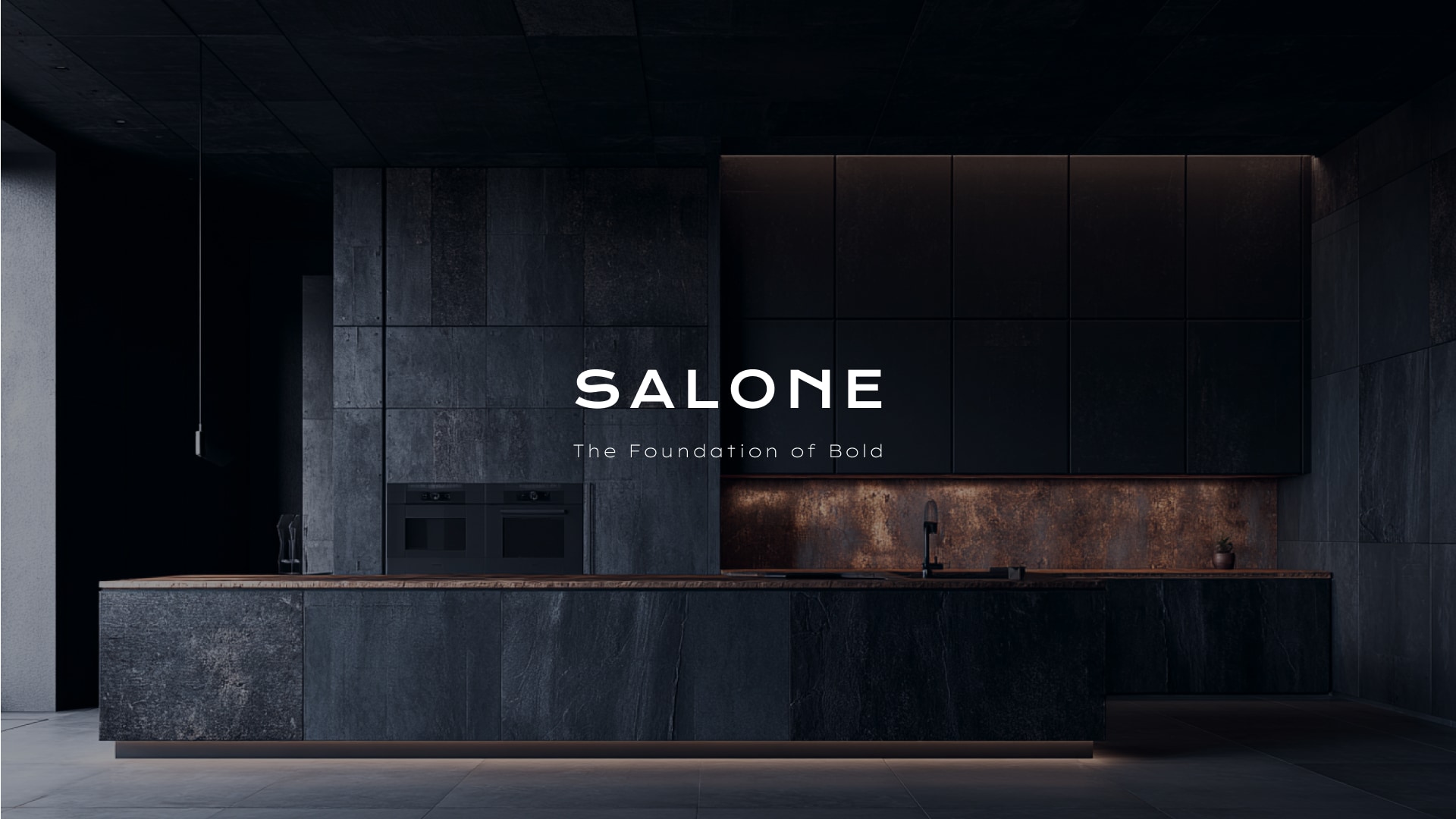
When a high-end interior designer or a multi-million-dollar property developer interacts with your building material supply business for the first time, what do they see? If your initial touchpoint involves a dated logo on a poorly formatted invoice, you might be losing the bid before they even touch your product. Recently, the Hillside Architects Brand & Digital Strategy team partnered with Salone to completely overhaul their visual identity. Our mission was to prove that for B2B building suppliers, a premium VI (Visual Identity) system is not just an aesthetic upgrade—it is a critical tool for building instant industry trust.
When a high-end interior designer or a multi-million-dollar property developer interacts with your building material supply business for the first time, what do they see? If your initial touchpoint involves a dated logo on a poorly formatted invoice, you might be losing the bid before they even touch your product. Recently, the Hillside Architects Brand & Digital Strategy team partnered with Salone to completely overhaul their visual identity. Our mission was to prove that for B2B building suppliers, a premium VI (Visual Identity) system is not just an aesthetic upgrade—it is a critical tool for building instant industry trust.
The Problem with the "Traditional" Supplier Look
Many material suppliers invest millions in product R&D but neglect their own branding. They use inconsistent colors, rugged fonts, and generic Word document templates for their quotes and invoices. However, architects are highly visual professionals. A disjointed brand identity signals a lack of precision, which makes designers hesitant to specify those products in high-stakes projects.
Phase 1: Establishing an Architect-Aligned Visual Foundation
To position Salone firmly in the luxury architectural tier, we initiated a foundational brand overhaul:
1. A VI Driven by Space and Texture
We moved away from the heavy, industrial look typical of the sector. Salone’s new logo and visual direction embrace generous white space and minimalist geometry, complementing the beautiful "macro-textures" of their flagship materials.
2. Precision in the Palette
For building materials, color accuracy is everything. We developed a strict standard color palette that ensures Salone’s brand colors remain perfectly consistent across digital screens and physical printouts, reflecting the exactness required in actual construction.
3. Elevating the Business Identity
Branding doesn't stop at the logo. We redesigned Salone’s entire suite of business collaterals. From elegant letterheads to meticulous, ATO-compliant invoice templates, we ensured that every time Salone submits a quote or a bill, it lands on an architect's desk looking like a document from a premium design house, rather than a standard hardware store.
Conclusion
The First Step to Being "Specified"
A powerful brand identity is the unshakable foundation for all future digital showrooms, sample books, and marketing campaigns. Because Hillside stems from an architectural discipline, we know what builds trust with industry decision-makers. By upgrading their VI, Salone is now visually equipped to dominate the premium market.

Connect with Hillside
Hillside Interior & Architecture
S1705, Level 17, Citadel Towers, Tower B, 799 Pacific Hwy, Chatswood NSW 2067
info@hillsidearchitects.com.au
02 8413 8558
© 2026 Hillside Interior & Architecture
Connect with Hillside
Hillside Interior & Architecture
S1705, Level 17, Citadel Towers, Tower B, 799 Pacific Hwy, Chatswood NSW 2067
info@hillsidearchitects.com.au
02 8413 8558
© 2026 Hillside Interior & Architecture